Friendship Day Poster Making Ideas for a School Competition
Quick answer: A strong Friendship Day poster combines one clear central image (like two joined hands or a tree with intertwined branches), a short, legible slogan, and a limited, harmonious color palette, rather than trying to cram in every friendship symbol at once. My son’s first poster competition entry, back in third grade, tried to fit hearts, joined hands, a rainbow, two stick figures, and three different slogans onto a single page, and it looked genuinely cluttered next to the simpler, more focused entries that ended up placing.
Watching what actually stood out that day, and in the poster competitions since, taught me a fair bit about what separates a poster that catches a judge’s eye from one that’s technically covered in relevant symbols but doesn’t communicate anything clearly.
The following year, we approached his entry differently, focusing on just one strong central image and a short, legible phrase, and the difference in how the finished poster actually read from a distance, which matters enormously in a competition setting, was considerable.
Why Simpler Posters Tend to Stand Out
A poster is usually viewed from some distance during judging, not held close and studied in detail, which means a single strong, clear image reads far better than several smaller ones competing for attention. My son’s second attempt used just one image, two hands intertwined with a simple vine motif, filling most of the page, and it was immediately more legible from across a room than his cluttered first attempt had been.
Limiting the color palette to three or four harmonious colors, rather than using every color available, also gave the second poster a more polished, intentional look, compared to the slightly chaotic rainbow effect of the first.
Strong Central Image Ideas
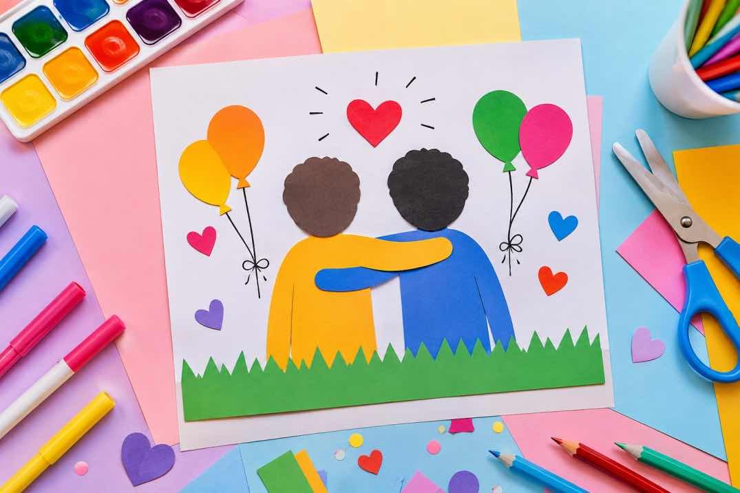
A tree with branches from two sides intertwining into one canopy works well as a central image, symbolizing two individuals growing together while remaining distinct. Two hands, joined or in a handshake, with a simple decorative border, is a classic, reliably clear image that reads well even from a distance.
A single, larger heart made of smaller elements, handprints, small figures, or simple patterns, filled in as a cohesive shape rather than scattered separately across the page, also creates a strong single visual focus rather than a busy composition.
Getting the Slogan Right
A short, legible slogan, in large, clear lettering, matters more than a longer, more poetic one that’s hard to read from a distance. Something like “Friends Forever” or “United in Friendship” communicates clearly, while a longer quote tends to get lost in smaller text that’s difficult to read during quick judging.
Placing the slogan in a consistent, clear font style, rather than overly decorative lettering that sacrifices legibility for style, has made a genuine difference in how quickly the poster’s message actually comes across.
| Cluttered Approach | Focused Approach |
| Multiple competing images | One strong central image |
| Many colors used at once | A limited palette of 3-4 harmonious colors |
| A long, poetic slogan in small text | A short slogan in large, legible lettering |
| Decorative but hard-to-read fonts | Clear, consistent lettering style |
The Short Version
A Friendship Day poster that stands out in competition judging tends to have one strong central image, a limited color palette, and a short, legible slogan, rather than trying to fit every possible friendship symbol onto a single, cluttered page.
Related Reading on PlayAndGrow
our Friendship Day drawing ideas for kids
Friendship Day quotes and speech ideas for kids
Friendship Day celebration ideas at school
Friendship Day wishes and messages for best friends
Questions Other Parents Ask Me
What makes a Friendship Day poster stand out in a school competition?
A single strong central image, a limited color palette of about three or four harmonious colors, and a short, legible slogan tend to read far more clearly during judging than a cluttered poster trying to include many elements.
What is a good central image for a Friendship Day poster?
A tree with intertwining branches from two sides, joined hands with a simple border, or a single cohesive heart shape all work well as clear, strong central images.
Should a Friendship Day poster include a long quote?
A short, legible slogan tends to communicate more effectively than a longer quote, since smaller text with more words becomes difficult to read from a distance during competition judging.
How many colors should a poster use?
Limiting the palette to around three or four harmonious colors tends to give a poster a more polished, intentional look compared to using many colors at once, which can appear cluttered or chaotic.